
UX Design
Blossomccrafts
UI DesignRole: UX/UI Designer
Tools: Figma
Platform: Web
This project was created to improve my UI skills through a realistic prospective project. My goal was to create a simple, aesthethically pleasing website while creating a good user experience and highlighting the unique selling point: the feature to customise your bouquet online.
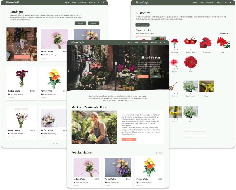
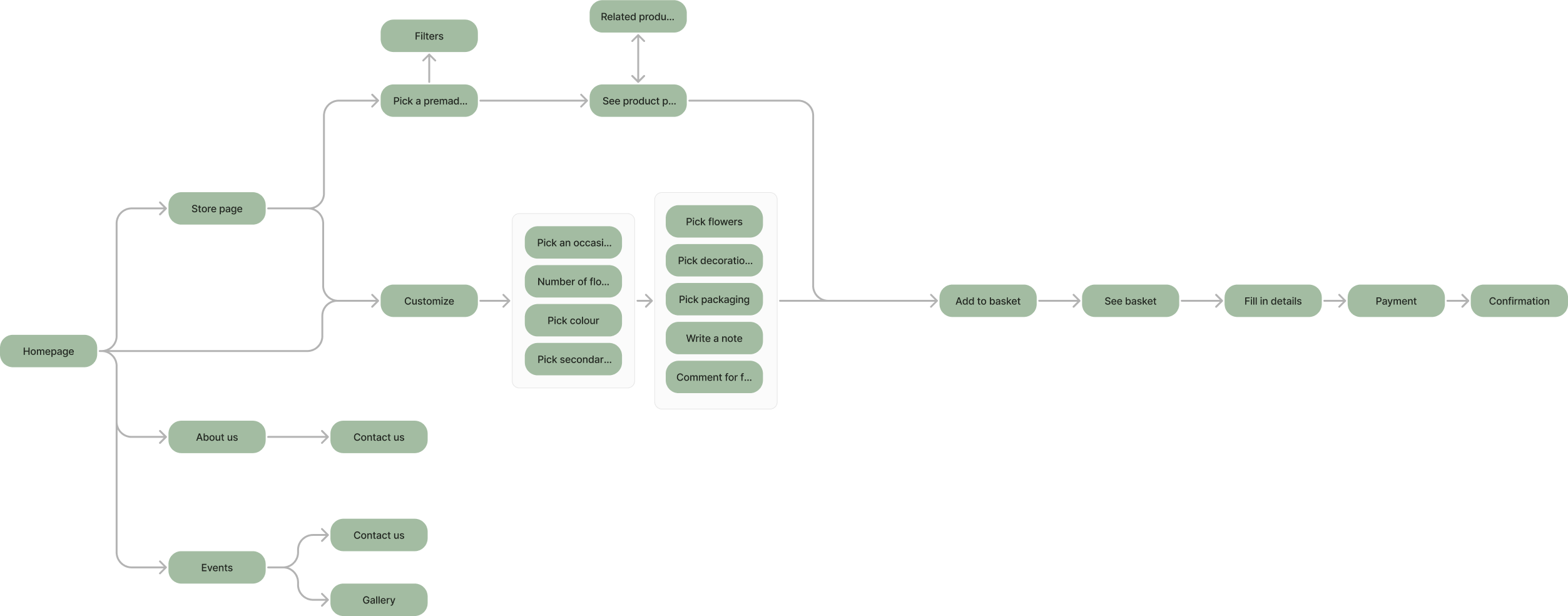
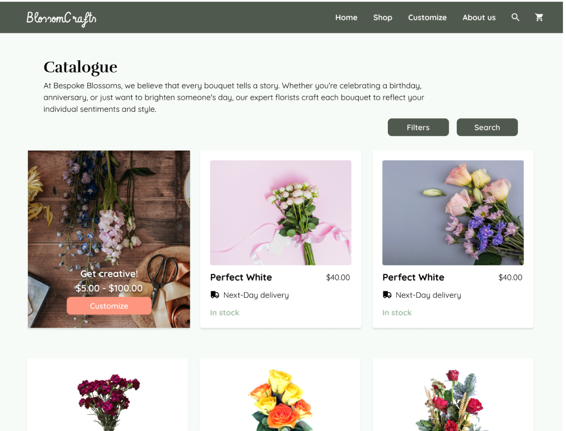
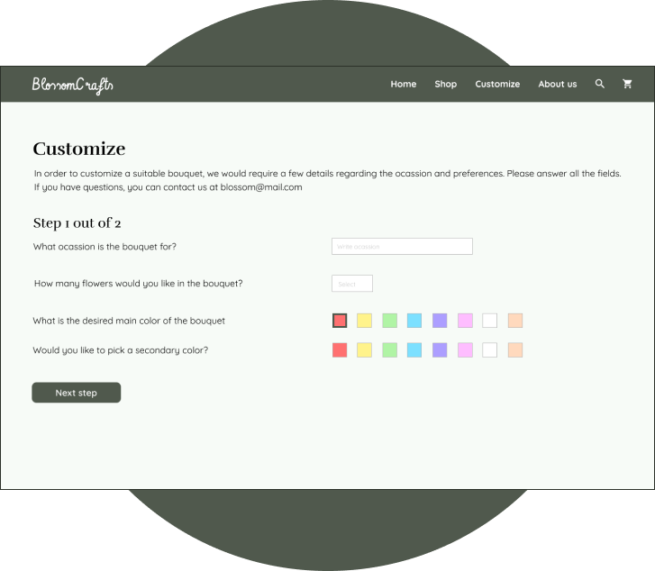
The most important part of the user flow was the "customizing" page where it was ideal to ensure that the user has the freedom to create the desired bouquet and can understand the available choices without having to go through every single item in stock
When multiple similar objects are present, the different one is most likely to be remembered. I have made use of this effect to ensure users are aware of the ability of building bouquets
The goal of the customization was to make the personalized bouquet creation process as visual as possible, mimicking an in-person bouquet picking experience. I broke the process into two steps to avoid overloading the user with too many tasks and made the amount of steps visible to the user at all times
Hick's law states that presenting a multitude of choices can make decisions harder for users, thus the first step of the customization process is to narrow down the future choices through letting the user pick the colors of the bouquet. That way, the list of available options of step 2 is much smaller
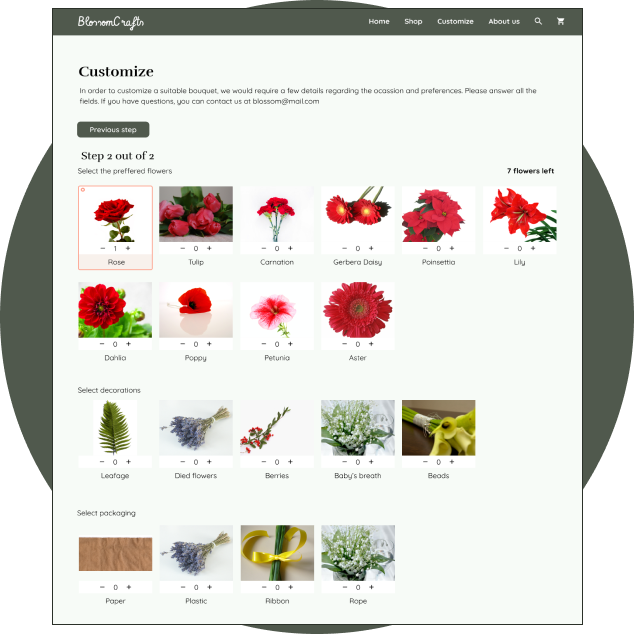
Pictures have been added in front of every flower to make the choice
more intuitive and avoid the necessity of having another tab open to
just google flower names. This is a user pain I found in other
competitor websites.
At this step the user selects the packaging too, because separating
this process might force the user to constantly return to the previous
step to remember what flowers they picked
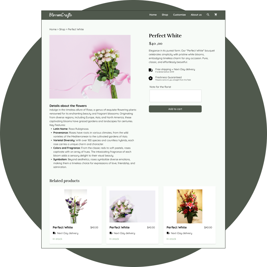
The website mimics the experience of other available e-commerce websites, especially for the shop and checkout section to foster familiarity for the user.
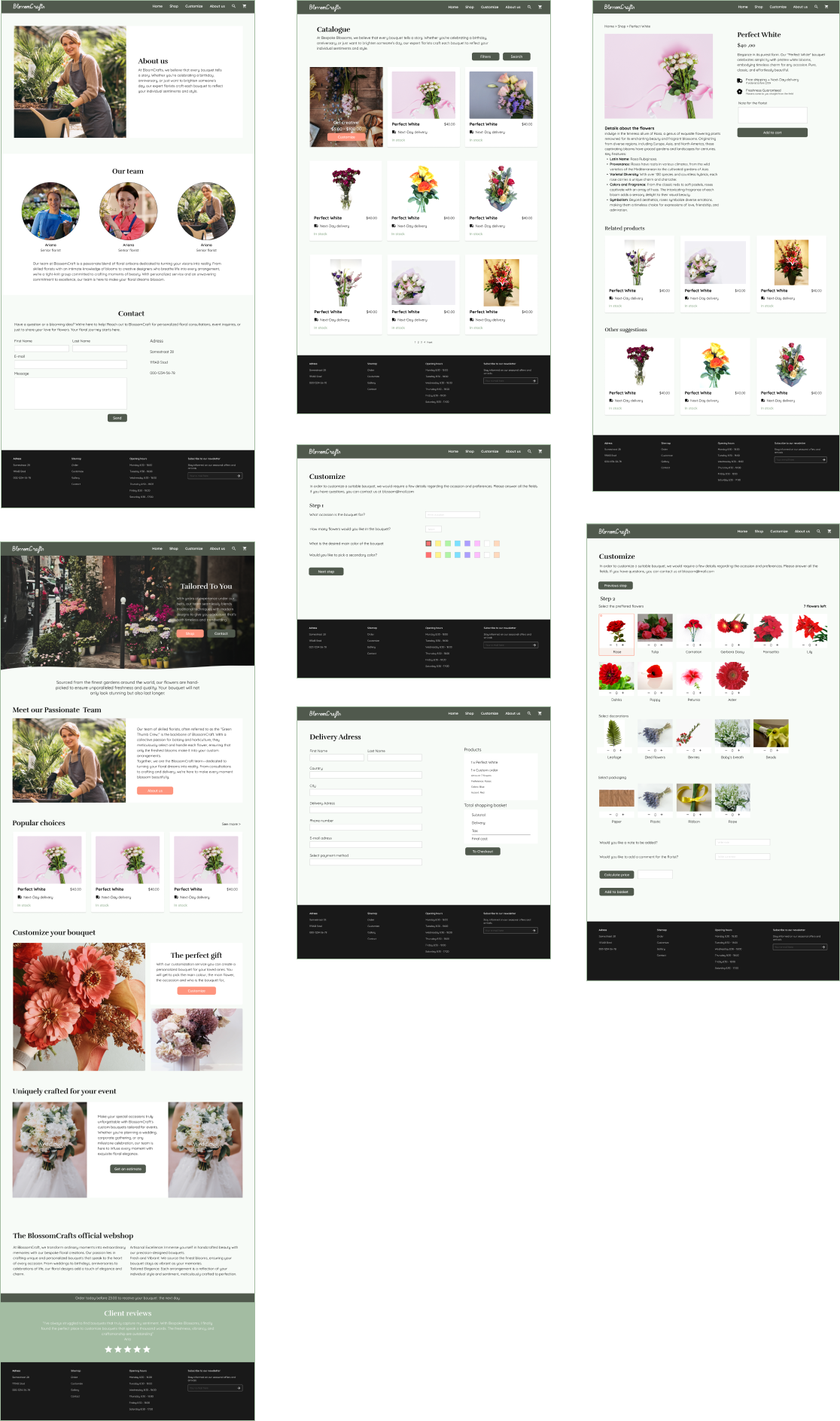
This project was a great learning opportunity to understand the details and requirements of a webshop, and how to implement those elements in a pleasing manner. I learned a great deal about standard practices, such as ensuring there is enough space for SEO text and incorporating client reviews,